Start From the Chart, Not the Data: [11 Visual] CRM Dashboard Outputs Every Sales Manager Needs in 2026
- Josh Jebathilak
- Jun 1
- 4 min read


The reporting you want is the easy part. Getting the data underneath it to cooperate is where teams come unstuck. So work backwards.
Josh Jebathilak | Fruition Services | monday.com Platinum Partner & CRM Specialists
Here is how most reporting projects go. Someone asks for a dashboard. The team looks at the data they already have. They build whatever that data allows. Six weeks later there is a dashboard, and it answers questions nobody was asking.
The problem is the direction. They started from the data and hoped a useful picture would fall out the other end. It rarely does.
Flip the order. Start from the picture you want in front of you. The exact chart. Then work backwards to the data and the relationships you need to produce it. The chart is downstream of the data model, always. Decide the destination first, then build the road to it.
This is the shift from asking what can we report on to asking what do we want to know, and what would have to be true in our data for us to know it.
First, the menu
You cannot reverse-engineer toward a destination you cannot picture. So here is what good sales, tendering, business development and account management teams actually put on a screen. Around thirty distinct reporting views, but they collapse into eleven chart forms. Learn the form and you know what it is built to reveal, and what it demands from your data.
1. The funnel
Conversion between sequential stages. Covers your stage funnel, weighted pipeline value, and bid funnels.
Needs: every deal tied to a stage, with stage history kept rather than overwritten.

2. The trend line
Anything moving over time. Win rate trends, new pipeline created, satisfaction by account.
Needs: every record stamped with a date you trust.

3. The horizontal bar
Ranking and comparing categories. Rep leaderboards, win rate by sector, deal aging, cycle length, channel ROI, lifetime value. Your workhorse.
Needs: every deal linked to the owner, account, source or segment you want to rank by.

4. Actual vs target
Performance against a goal, at a glance. Gap to quota.
Needs: deals linked to an owner, and a target set per owner per period to measure against.

5. The scatter or bubble
Whether one thing moves with another. Activity versus win rate. Cost to bid versus value won.
Needs: activities logged and linked back to the deal, plus an outcome recorded on that deal.

6. The timeline
Obligations spread across the calendar. Tender deadlines. Renewal pipeline.
Needs: every tender or contract carrying a date and a value.

7. The Sankey
How volume flows from source through to result. Lead source attribution. Influenced pipeline. The attribution view most teams want and almost none can build.
Needs: the chain held intact, from lead to source to deal to revenue, with nothing dropped along the way.

8. The pareto
The vital few that drive the majority. Loss reasons ranked. Revenue concentration.
Needs: a structured reason field, a dropdown rather than free text, and revenue tied to account.

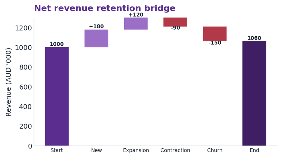
9. The waterfall
How a number is built up or eaten away. Net revenue retention across new, expansion, contraction and churn.
Needs: revenue tracked per account across periods, with each movement categorised.
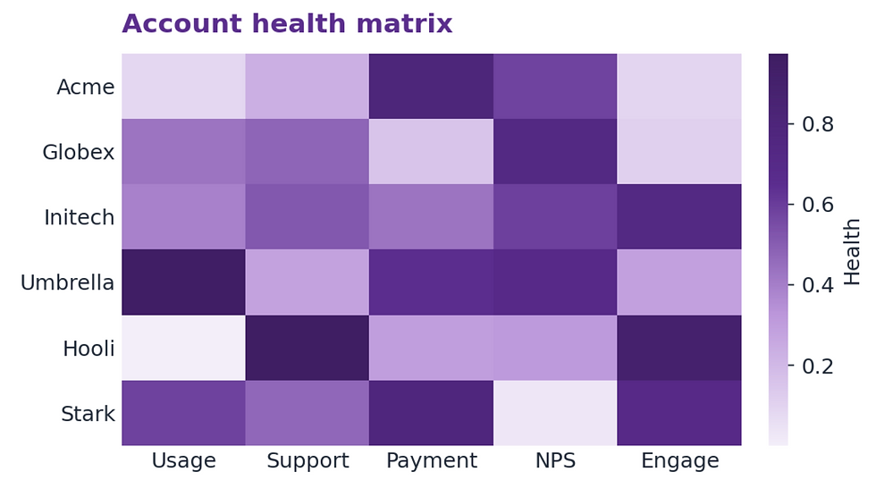
10. The heatmap
Two dimensions meeting, with colour carrying the signal. Account health. Whitespace. Engagement recency.
Needs: each account joined to several signals (usage, support, payment, last contact) in one place.
11. The stacked column
Bars with a meaningful internal split. New logo versus expansion. Margin at quote versus delivery.
Needs: each deal flagged by the category that splits the bar.

The bit everyone skips
Notice the pattern in those needs lines. Almost none of them are about having more data. They are about relationships. A deal connected to an owner. A lead connected to a source. An account connected to its revenue history.
The hardest and most valuable views, attribution, retention and account health, all depend on relationships that teams either never set up or quietly let rot. Free text where a dropdown should be. A source field nobody fills in. Stage changes that overwrite the last one instead of keeping the trail.
That is why the reporting conversation is really a data conversation wearing a different hat. The chart is never the hard part. The relationships underneath it are.
The honest list
Do this and something useful happens. Your wishlist of reports turns into a short, honest list of what your data can and cannot yet support. That is a far better place to start than a pretty dashboard built on sand.
At Fruition we run this exercise with sales, tendering and account teams before we touch a single dashboard. Start from the chart you want. Build the relationships that make it true. Everything else follows.
Fruition Services helps mid-market sales, tendering and account teams design the data model before the dashboard. monday.com Platinum Partner. www.fruitionservices.io


