monday CRM Sales Dashboard Guide for 2026: Reporting Training, Sales Funnels, and More
- Ishani Dhar Chowdhury

- Dec 18, 2025
- 6 min read
Do you find actionable insights for business growth in your sales report? Reports suggest that companies are 28% more likely to find relevant data while using visual dashboards rather than relying on standard reports.
Perhaps you only get access to overwhelming data that you cannot decode. That's why tools like monday Sales CRM can be helpful with the right CRM analytics training.
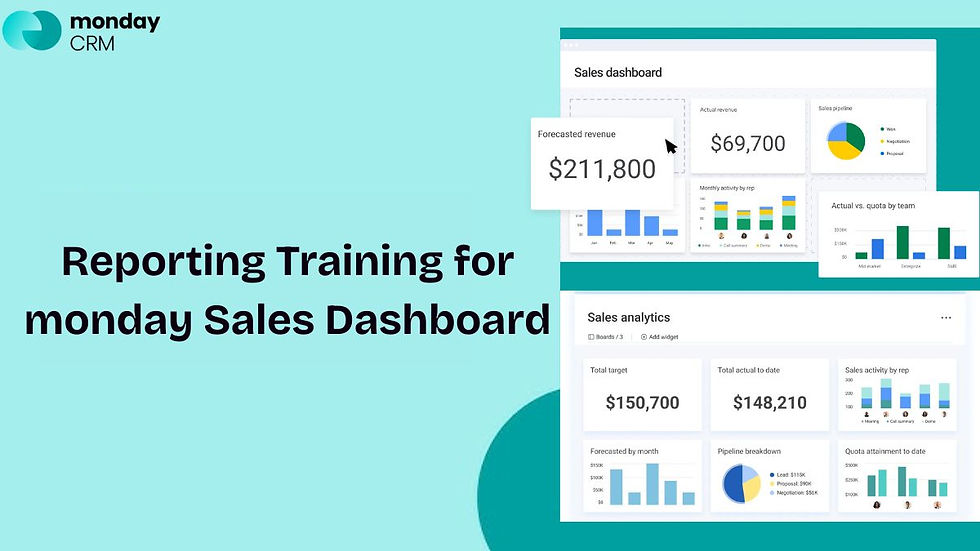
In this monday CRM sales dashboard guide, we'll empower sales managers to transform raw data into visual intelligence. You can build an effective conversion funnel tracking with monday.com dashboards, revealing bottlenecks, optimising team performance, and accelerating deal closure.
Read on to master these reporting fundamentals to help make data-driven decisions.
What's Sales Funnel Visualisation in monday CRM?

Sales funnels are the visual representation of your customer journey. It begins with initial contact, goes through conversion, and ends with a closed deal.
In this monday CRM sales dashboard guide, we'll understand how to map each pipeline stage clearly with data visualisation. You'll have to begin by identifying your funnel stages:
Lead generation.
Qualification.
Proposal.
Negotiation.
Closure.
Each stage requires specific metrics for accurate tracking of the conversion funnel. They include:
Stage-to-stage conversion rates.
Deal velocity across the pipeline.
Average time spent per stage.
Revenue forecasts by stage.
As monday.com experts, our team at Fruition suggests creating dedicated boards for every major sales process. Follow these use cases to avoid potential bottlenecks:
Use status columns to represent funnel stages automatically.
Instant CRM analytics training from visual board layouts.
Configure funnel view by selecting the appropriate chart type.
Visualise pipelines with funnel charts and transform data into actionable intelligence.
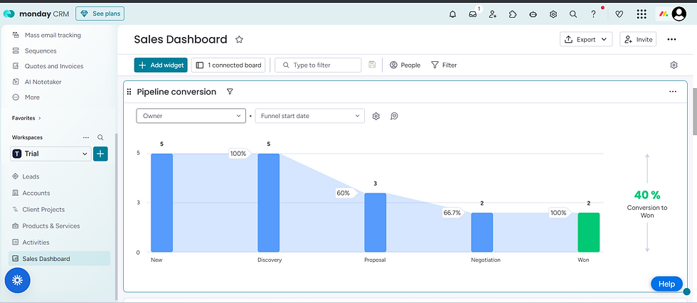
monday CRM Sales Dashboard Guide: Building Conversion Funnels
Did you know that the average conversion rate across industries is about 2.9%? Tracking this will showcase your sales team's effectiveness at each stage.
This monday CRM sales dashboard guide will help you prioritise conversion metrics and pipeline data prominently. All you have to do is:
Start with a dashboard widget to display overall conversion percentages.
Calculate conversion (dividing deals advancing by total deals entering) for each stage.
This conversion funnel tracking in monday.com quickly identifies underperforming areas. Some essential conversion widgets include:
Lead-to-opportunity.
Proposal-to-close.
Opportunity-to-proposal.
Overall pipeline conversion percentage.
You can add time-based filters to analyse conversion trends quarterly, yearly, and monthly. Based on that, teams can compare current performance against historical benchmarks for meaningful CRM analytics training.
Highlight conversion drops with colour-coded thresholds. For example, set green indicators for rates above target, yellow for approaching goals, and red for underperformance. Visual cues enable quick assessment without having to dive into raw numbers.
Multi-Dimensional Sales Reports: Ultimate Visualisation in monday CRM

You'll have to view data simultaneously through multiple lenses to ensure comprehensive reporting. This monday CRM sales dashboard guide helps you incorporate various analytical dimensions.
For robust analysis, you can get these options:
Geographic territory analysis.
Time period comparisons.
Product or service category breakdown.
Customer segment performance.
Sales representative performance comparisons.
Use formula columns for calculated fields to build conversion funnel tracking reports in monday.com. For example, combine data from multiple boards to create a consolidated view. Connect related items across boards for complete customer journey visibility.
You can also leverage:
Chart widgets to visualise multi-dimensional data.
Battery charts to show individual sales teams' performance against quotas.
Pie charts to reveal revenue distribution across product lines.
Line graphs to track trending performance over time for predictive CRM analytics training.
You can also configure automated report generation based on scheduled intervals. As a result, you can save time and maintain consistent communication about pipeline health and forecast accuracy.
Implementing Real-Time Dashboard Updates: CRM Analytics Tutorial

Forbes states that dashboards are a non-negotiable entity in business management. With the right reports, teams get a clear understanding of workflows and operations.
However, static reports become outdated the moment they are generated. Thankfully, this monday CRM sales dashboard guide highlights how modern platforms demand real-time data visualisation.
That means you can connect dashboard widgets directly to live board data. As a result, every deal update, new entry, or status change is reflected instantly. This approach eliminates refresh delays and version confusion.
The real-time benefits include:
Immediate identification of at-risk deals.
Live team performance monitoring.
Instant visibility into pipeline changes.
Current quota attainment tracking.
Set up CRM automation recipes to trigger dashboard alerts for significant events. For example, notify managers when deals move to closing stages, and flag opportunities stalled beyond typical timeframes. This type of CRM analytics training, with the right automations, can transform dashboards from passive displays into active management tools.
Fruition specialises in configuring advanced automation workflows to keep your sales dashboard updated. Our monday CRM expertise extends to building intelligent alert systems that notify the right people at precisely the right moments.
Advanced Analytics and Forecasting Tools: monday CRM Sales Dashboard Guide
Sophisticated forecasting will separate reactive management from proactive strategy. This monday CRM sales dashboard guide will highlight the importance of incorporating predictive analytics capabilities.
Many monday users take advantage of the weighted pipeline forecasting by assigning probability percentages to each funnel stage. Then, you can multiply deal values by stage-specific close rates in this sales dashboard.
This technique produces realistic revenue projections rather than optimistic best-case scenarios. Some of the advanced analytics features include:
Trend analysis for seasonal pattern identification.
Sales cycle length analysis for process optimisation.
Win/loss ratio tracking by region or product.
Team member-specific conversion pattern recognition.
What-if scenario dashboards with different outcome possibilities.
These will help you test how closing specific deals impacts quarterly targets. You can also evaluate resource reallocation effects on projected results. These CRM analytics training exercises prepare leadership teams for multiple contingencies.
You can also integrate external data sources, correlate sales activities with marketing campaigns, and compare internal performances. This holistic analysis reveals opportunities invisible in isolated CRM data.
Why Does the monday CRM Dashboard Work?
monday CRM dashboards succeed because they transform complex data into instant visual clarity. Unlike traditional spreadsheet reports (that require manual analysis), this feature delivers real-time intelligence.
This monday CRM sales dashboard guide showcases how this feature offers data visualisation through intuitive graphics and colour-coded indicators. Moreover, the platform's flexibility allows you to customise views to match their exact CRM analytics training needs.
Key advantages include:
Drag-and-drop widgets that enable rapid assembly.
Easy modifications as business requirements evolve.
Faster deployment because there's no coding required.
Customisable layouts for different management levels.
Visual learning principles also drive dashboard success. For example, progress bars, graphs, and charts communicate trends instantly.
On top of that, integration capabilities strengthen dashboard effectiveness.
Sync external data sources for a holistic market context.
Real-time conversion funnel tracking in monday.com across departments.
Automated updates eliminate manual data entry mistakes.
Connect multiple boards for comprehensive tracking.
As a sales manager, you can identify problems and opportunities within seconds. This speed will transform reactive management into proactive strategy execution.
Endnotes
Do you want to transform monday CRM from a database into a strategic intelligence platform? Then, you'll have to create an effective sales dashboard.
In this monday CRM sales dashboard guide, you learnt how implementation empowers data-driven decision-making. Visual conversion funnel tracking in monday.com ensures accuracy. Similarly, comprehensive CRM analytics will provide performance visibility for competitive sales management.
Partner with Fruition to accelerate your dashboard deployment. We'll ensure your team leverages the full analytical potential of monday CRM. Reach out today.
FAQs
How often should you review monday CRM sales dashboards?
Every monday CRM sales dashboard guide will highlight how independent and automated this feature is. Even then, it's best to review them daily for deal movement. For trend analysis, check the CRM dashboard weekly. Aim for monthly deep dives to identify strategic adjustment needs for consistent quota attainment and improve forecasting.
Can you separate dashboards for different team members?
monday CRM supports permission-based dashboard views. That means you can create role-specific views. This ensures every sales representative sees only relevant data for their daily workflows and operations. They can see individual metrics, while managers or team owners can access company-wide analytics and comprehensive reporting.
What's the ideal number of widgets for a sales dashboard?
While you can add multiple widgets for CRM analytics training, it's best to keep the dashboard uncluttered. Limit dashboards to five to eight key widgets. This will prevent information overload and keep data streamlined. Focus on metrics directly influencing decisions rather than displaying every available data point.


